Until this season, New York’s fashion week has been in danger of losing some major cache and cred. First, because a number of pillar names had opted to show in Paris during the couture season; and second, because even the big names were doing mostly the same-old. The blockbuster brands that hold the most pull had a mix of hits and misses this season. Hits, when they understood their time and audience; and bombs when they stubbornly refuse change.

It’s not the case, however, for Calvin Klein, which is now in its fourth main season under the direction of Raf Simons. I think it must be pointed out now that though Simons is chief creative officer, the 205W39NYC runway collection is very much also the work of Matthieu Blazy and Pieter Mulier. The former was the designer behind Maison Martin Margiela’s artisanal line and the latter the famous right-hand man to Simons.
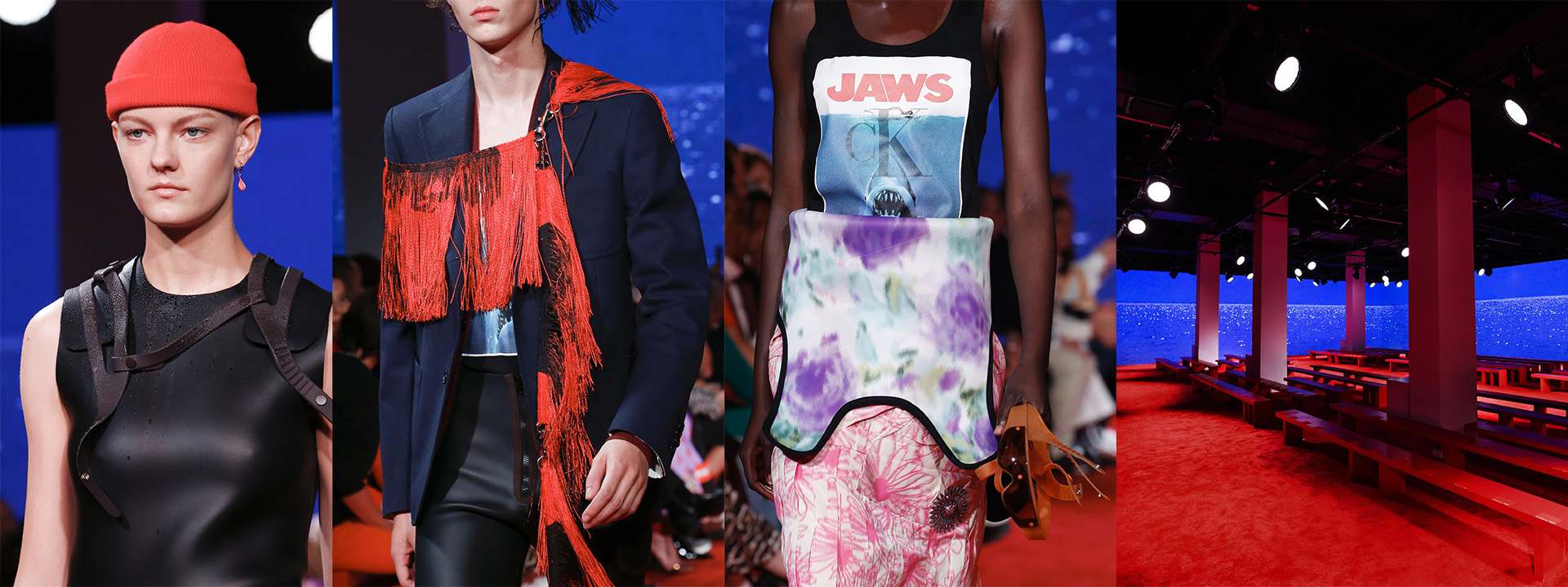
Anyway, the arcing narrative for 205W39NYC so far has been America as seen by outsiders. Which is a refreshing take, especially as Simons and his team seem able to pick up on the most pluralistic and lowbrow cultural inspirations and drive them up to something more cerebral. Recall his horror references from his first collection: car crashes by Andy Warhol and serial killer axes by Sterling Ruby. And a continued milking of the Andy Warhol foundation – because the man’s work is possibly the most accessible of the iconoclastic American artists. This season, the big bad is Jaws, the classic of American horror and hysteria.
The implication of violence was found here in skirts torn and ripped to create slits, and dresses with printed fabrics torn apart and put back together again for an unnerving textural effect. That, alongside more thematic tropes like lycra wetsuits undone at the torso to show a tank top underneath – mostly printed with the Jaws poster and the Calvin Klein logo superimposed.

And then there was The Graduate, which was cited as a key reference to the collection. If we manage to look beyond the literal (graduation gowns and caps), the hysteric psyche of youth and sexuality is compatible with a narrative about violence. Suddenly the damaged skirts look like a subtle comment on rape culture in universities. Sharks, in Jaws, are signalled by music and the ominous fin. You see a tiny bit of the monster, and you wait as it circles to attack. I’ll let you fill in the rape parallel.
But while all this gave us something to think about, and references to unpick, the collection rang a little hollow. It didn’t dig as deep as, say, Spring/Summer 2018 which cuttingly took the unsettling to the surface. This collection, with its wet hair and wetsuit styling, felt hokey. A lot of the clothes were simply uninteresting. Those dresses, with their funked up fabrics, tended to lose a lot of their shape because of the construction and ended up looking like the remains of a Miu Miu collection that didn’t make the cut.

This kind of problem was the case at Tom Ford as well. The designer’s collection was a sexy one – what else were you expecting? – but this time Ford shed all pretense of trying to provide sportswear or leisurewear. Glamour and high-octane sex appeal has been his calling card, and everyone will no doubt bring up the Gucci days. Well, that’s the problem. We want the Gucci days from Tom Ford, but when he does it as he did this Spring/Summer 2019 season, it is absolutely out of touch with the times.
The politics of sex and gender have progressed, and the sort of lace-hemmed negligee dresses he sent down the runway felt dated and too much like a Carine Roitfeld cliché. So, too, have the cultural discussions around class and privilege progressed. Tom Ford is undeniably and unabashedly luxurious – sure. But the stiff crocodile leather jackets and peplums felt more like a cage to the stereotype of the lifestyles of the rich and famous. Look to Azzedine Alaïa instead if you want to see crocodile molded for the body in clothing.

But Ford knows how to make clothing undeniably. In the simpler instances, you could see the hand of a skilled and experienced designer. In fabric, cut, and finish. When he tries more experimental cuts, however, it can fall flat. You could see this in a number of tailored women’s looks that inexplicably had shoulders and halves chopped off to be replaced with a weird floating panel of fabric to just cover a breast. It was weird and unflattering. But that’s better than the menswear, which was completely nondescript and not worth talking about.

Another brand of same-old that might want to take a reconsidered look is Coach. Stuart Vevers is a very talented designer who’s refreshed and given new life to the brand thanks to its Coach 1941 runway line. He has a very clear and definite vision for the brand – which is a sort of dusty Americana that’s a little rugged and eccentric, drawing from the Wild West and a wandering spirit. It’s great. It’s also getting a little tired.
The brand cites “a trip to the Ghost Ranch in Santa Fe” and “Americana through the eyes of the new New Romantic”. Accidental ‘new’ aside, this description is a little moot. I wouldn’t be able to tell you the referential and inspirational differences from this collection and the last three. They all have the signature prairie dresses (which are, truthfully, very good), large leather jackets with occasional shearling, and a cartoon print on tees and hoodies for the entry-level shopper. It’s all the same.


Vevers might do well to think about the spirit of Americana in the abstract and divorce it from its strictly physical manifestations. The word is rich in association, and it’s absurd to keep coming back to prairie dresses to describe and define a brand.

When we talk about defining a brand, it helps to think beyond signature pieces and styles. The incorporeal is often more fruitful for continuation. Proenza Schouler, for me, have worked very hard to define themselves as a high-craft American brand. When it showed in Paris’ haute couture week, I was astonished to think that the clothes on the runway were ready to wear. The level of work and development that Jack McCollough and Lazaro Hernandez have put into their clothing is admirable. It’s also impractical.
For that kind of price, the runway pieces will never sell the way they need them to. I see them at clearance sales, tossed around and manhandled – and it breaks my heart because these are very complex and well-made garments. They just weren’t very easy to wear.

Which is good, because those seasons now seem like brand building. The Proenza boys sent out a simple and straightforward collection for Spring, and it was so refreshing because the styles were so accessible. Acid-washed denim was a big element of the collection. It came as coats, dresses, skirts, jackets, shirts – bleached so pale and desaturated that it began to bear a soft and welcoming touch. The dresses were lovely too. There was a trio of black cotton dresses with contrast stitching that were skillfully constructed and absolutely convincing.


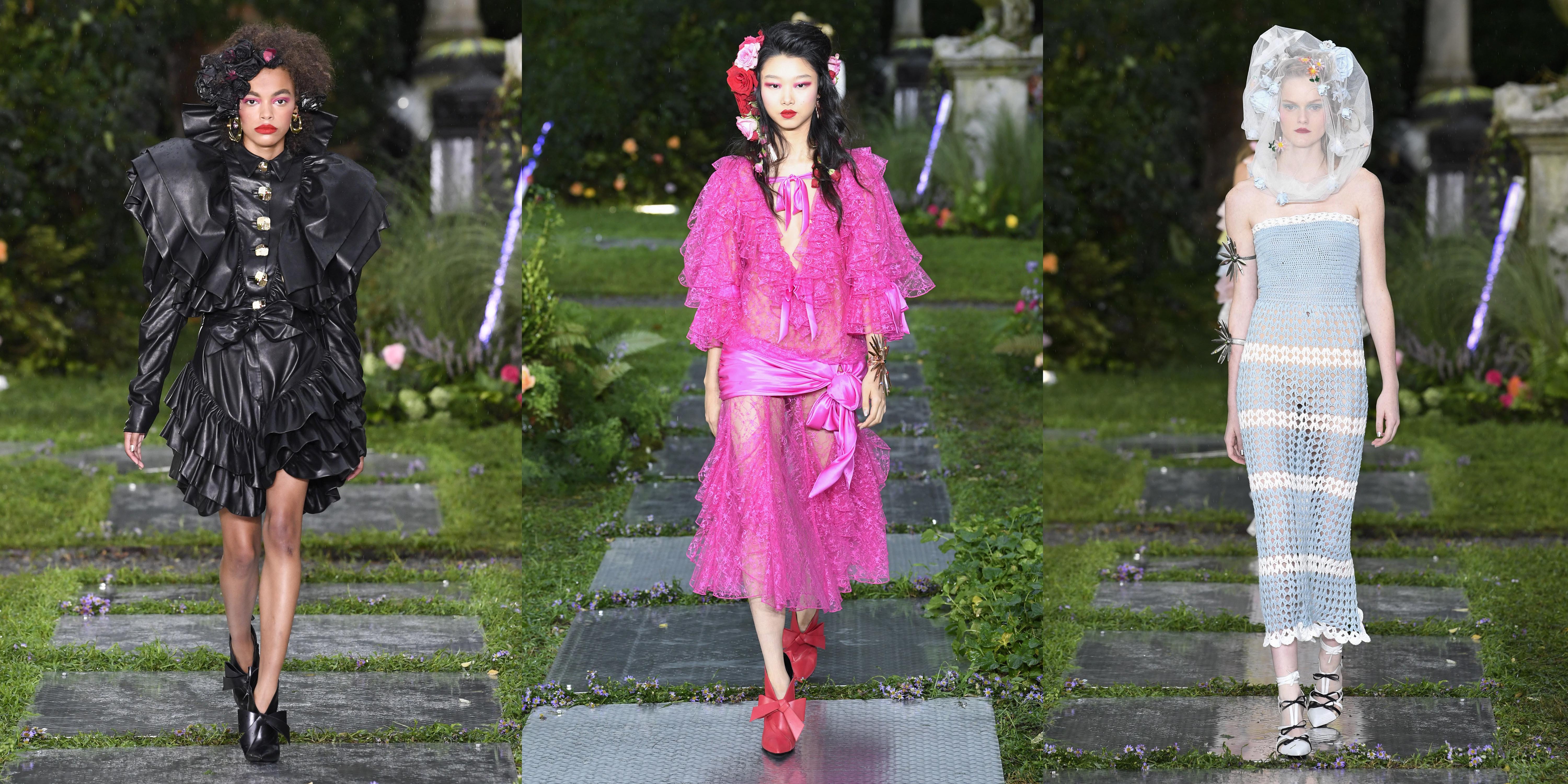
At Rodarte, the Mulleavy sisters have also returned to New York after a brief stint showing in Paris. The brand has always stood for a whimsy and fantasy that is unusual to American designers. The country’s tradition of fashion design is mostly pragmatic, after all. So it was a moment of transportation and imagination as Rodarte sent out brides and bridesmaids at a cemetary.
It had a witty dissonance that underscored how pretty the clothes were. The collection was, essentially, a one stop shop for Spring wedding season. There was a lot of tulle, which was used so campily that it looked gleeful and intoxicating. A lot of these dresses might sound in theory like bad style, but at Rodarte it’s done with enough intent, humour and talent that the results are intoxicating. It's rare to find this sort of fantasy, and like the best blockbuster films they take you away, even if just for a moment.


